How to Design a Logo That Looks Great on Merchandise
Okay, so you've decided it's time to design a logo. Maybe you're starting a business. Maybe you're rebranding. Maybe you just looked at your current logo and thought, "Who approved this?" No judgment, we've all been there.
Here's the thing, though: designing a logo isn't just about making something that looks cute on your Instagram bio. If you want that logo to live on a custom hoodie, a branded tumbler, or a trade show tote bag, you need to design it with merchandise in mind from the start. Otherwise, you'll end up with something that looks like a blurry postage stamp when it gets printed on a mug.
Don't worry, we're breaking the whole process down so you can design a logo that looks great everywhere. And yes, we're talking about how to design a logo for free, too, because not everyone has a designer on speed dial.
First, What Actually Makes a Logo "Merchandise-Ready"?
Before you open a single design tool, it helps to know what you're actually aiming for. A great logo for merchandise isn't just pretty, it's practical. Here's what that looks like:
It's simple. Nike. Apple. FedEx. The logos everyone can draw from memory are almost always the simplest ones. Fewer details = easier to print, easier to embroider, easier to recognize from across a trade show floor.
It works in one color. Your logo might look incredible in full color on screen, but the moment you want it embroidered on a black jacket or screen-printed in a single ink, you'll need a version that still works. Always design with a one-color version in mind.
It's scalable. If your logo has tiny text or fine details that disappear when it's shrunk down, that's a problem waiting to happen. Test it small. Like, really small. If it still reads clearly at thumbnail size, you're good.
It's saved in the right file format. More on this later, but spoiler: you want a vector file, not a JPEG.
Step 1: Get Clear on Your Brand Before You Touch a Design Tool
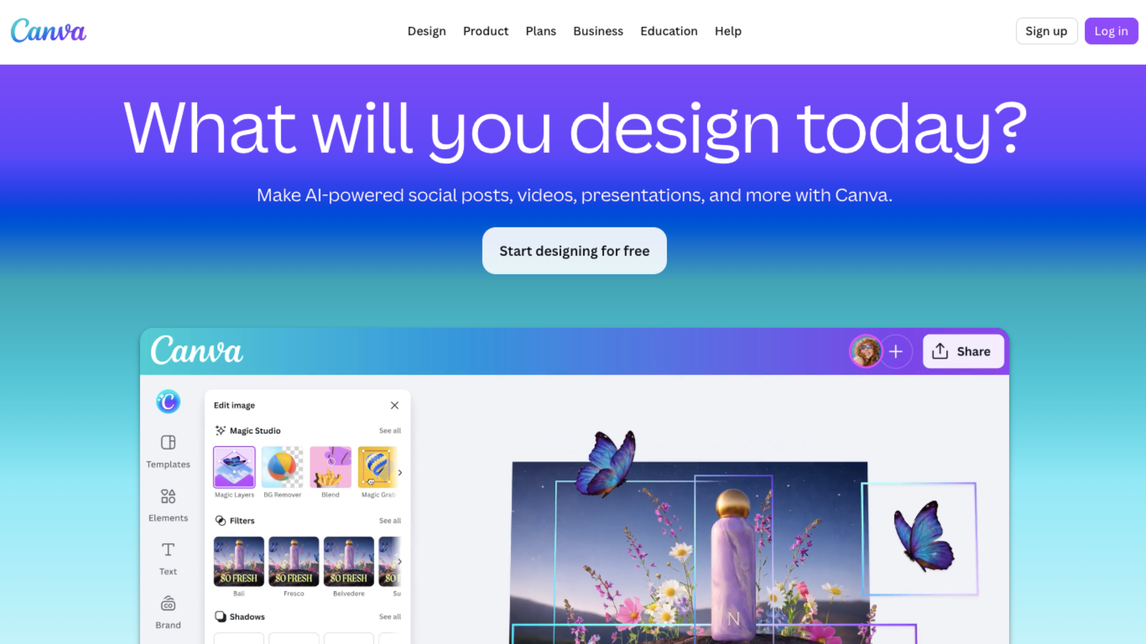
Here's a mistake a lot of people make: they open Canva, start playing with fonts, fall in love with a shade of teal, and call it a logo. The result is usually something that feels a little... random.
Before you start designing, spend 10 minutes answering these questions:
What does your business actually do? (Be specific. "I sell stuff" is not going to help you.)
Who is your customer? A Gen Z streetwear brand and a corporate law firm should not have the same logo.
What three words describe your brand vibe? Bold? Friendly? Luxe? Minimal? Write them down.
Who are your competitors, and what do their logos look like? You want to fit into your industry while still standing out.
This exercise sounds boring, but it's genuinely the thing that separates a logo that works from one that just kind of exists.
Step 2: Choose Your Logo Type
Not all logos are the same. There are a few different styles, and knowing which one fits your brand makes the designing part way easier:
Wordmark — Just your business name, stylized. Think Google, Coca-Cola, FedEx. Works great when your name is short and memorable.
Lettermark — Your initials only. IBM, HBO, NASA. Good if your full name is long or hard to remember.
Icon/Symbol — A graphic with no text. Apple, Twitter (well, X now), Nike. These are powerful but take time to build recognition.
Combination mark — An icon plus your name. This is the sweet spot for most small businesses and the most versatile option for merchandise.
Emblem — Text inside a badge or seal shape. Think Starbucks or Harley-Davidson. Looks amazing on apparel and patches. Just don't make the details too tiny.
For merchandise specifically? A combination mark or emblem tends to work really well because you get flexibility, you can use the icon alone on small items, and the full logo on larger ones.
Step 3: Pick Colors (But Not Too Many)
Color is powerful. It's also where a lot of logo designs go sideways.
Stick to 2-3 colors maximum. More than that, and your logo starts to look busy and it becomes a nightmare when you're printing on merchandise, especially with embroidery or screen printing, where every color adds cost.
A few things to keep in mind:
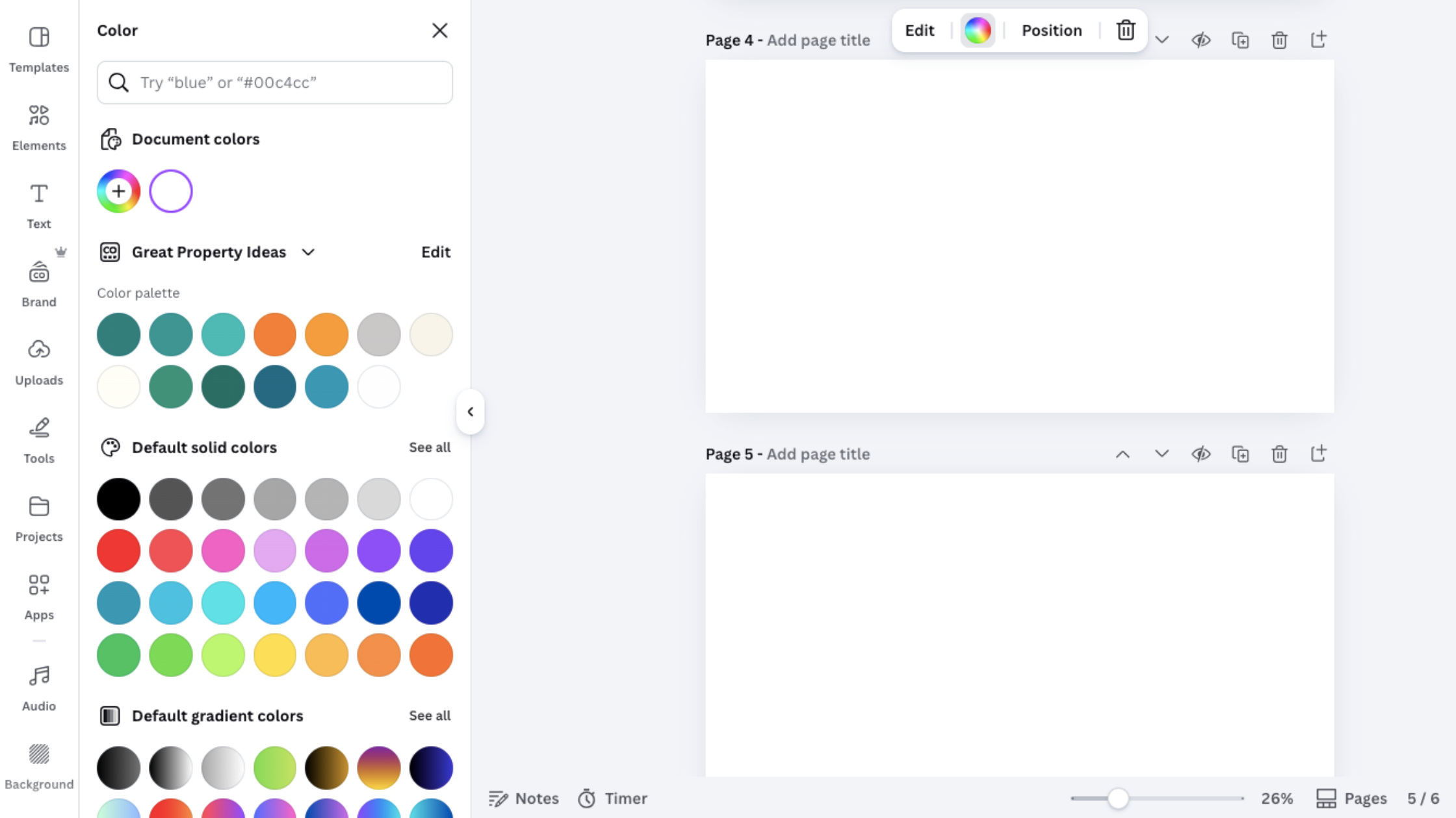
Contrast matters. Your logo needs to work on light and dark backgrounds. A pale yellow logo on a white hoodie? Invisible. Always check both.
Consider your industry. Blue signals trust (finance, tech, healthcare). Green reads as natural or health-focused. Black and gold feels premium. Think about what your colors communicate, not just what you personally like.
Check your colors in grayscale because some merchandise (and some print situations) will strip the color out entirely. Does your logo still make sense in black and white? It should.
Step 4: Choose Fonts That Actually Print Well
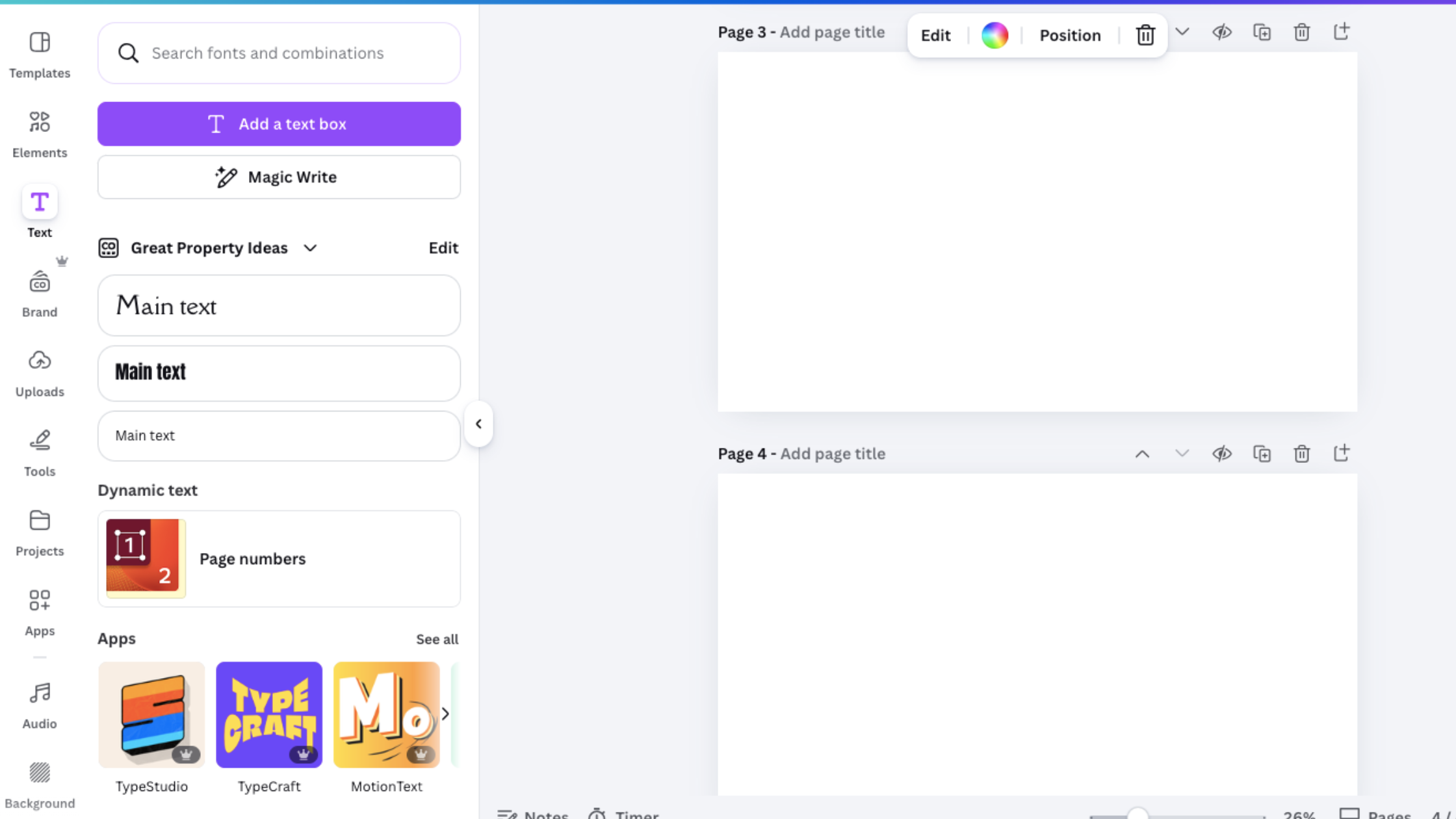
Typography is where a lot of logos quietly fall apart on merchandise. Thin, delicate fonts look gorgeous on screen. On a screen-printed tee or embroidered cap? They turn into an unreadable mess.
Here's what to look for in a merchandise-friendly font:
Avoid ultra-thin strokes. They disappear when printed small.
Avoid super intricate scripts. Cursive can be beautiful, but if the letters are too connected or detailed, they bleed together in print.
Prioritize legibility over personality. You can add personality through color, layout, and icons. Your font's main job is to be read clearly.
A solid pairing that works for almost any brand: a clean, bold sans-serif for the main name, and a simple secondary font for a tagline if you have one.
Step 5: How to Design a Logo for Free (Seriously, These Tools Work)
You don't need to spend thousands on a designer to get a solid logo, especially when you're just starting out. Here are some genuinely useful free tools for designing a logo:
Canva — Hugely popular for a reason. Drag-and-drop, tons of templates, easy to use with zero design experience. The free version is more than enough to create a basic logo. Pro tip: Use the transparent background export so your logo can sit on any surface.
Looka — AI-powered logo maker. You put in your brand name and answer a few style questions, and it generates options. Not all of them will be winners but it's a fast way to get ideas flowing.
Hatchful by Shopify — Free, simple, and designed specifically for small businesses. Great if you want something clean and professional quickly.
Adobe Express — Free tier available. More design flexibility than Canva in some areas, and it integrates with other Adobe tools if you ever upgrade.
One important note: whatever tool you use, try to export as an SVG file (Scalable Vector Graphic). This is a vector format, which means your logo can be scaled to any size without losing quality. It's also the format most merchandise printers will ask for. If your free tool only exports JPEGs or PNGs, that's okay for now, just be aware you may need to convert it later.
Step 6: Test It on Actual Merchandise Before You Commit
This is the step most people skip, and it's the one that causes the most regret.
Before you order 500 branded tote bags with your new logo, test how it looks on the type of product you want to print on. Consider:
Does it still look clear when scaled to the size of a chest logo on a shirt?
Does the color work on the color of the product you've chosen?
Is there enough contrast for it to be visible?
Does it look good without color if the printing method is single-ink?
A lot of merchandise suppliers will offer a digital proof before you print, so take advantage of that. It's much better to catch a problem before the order goes through.
Ready to Put That Logo to Work?
Once your logo is sorted, the fun part starts: getting it on stuff. And honestly, this part is way easier than most people expect.
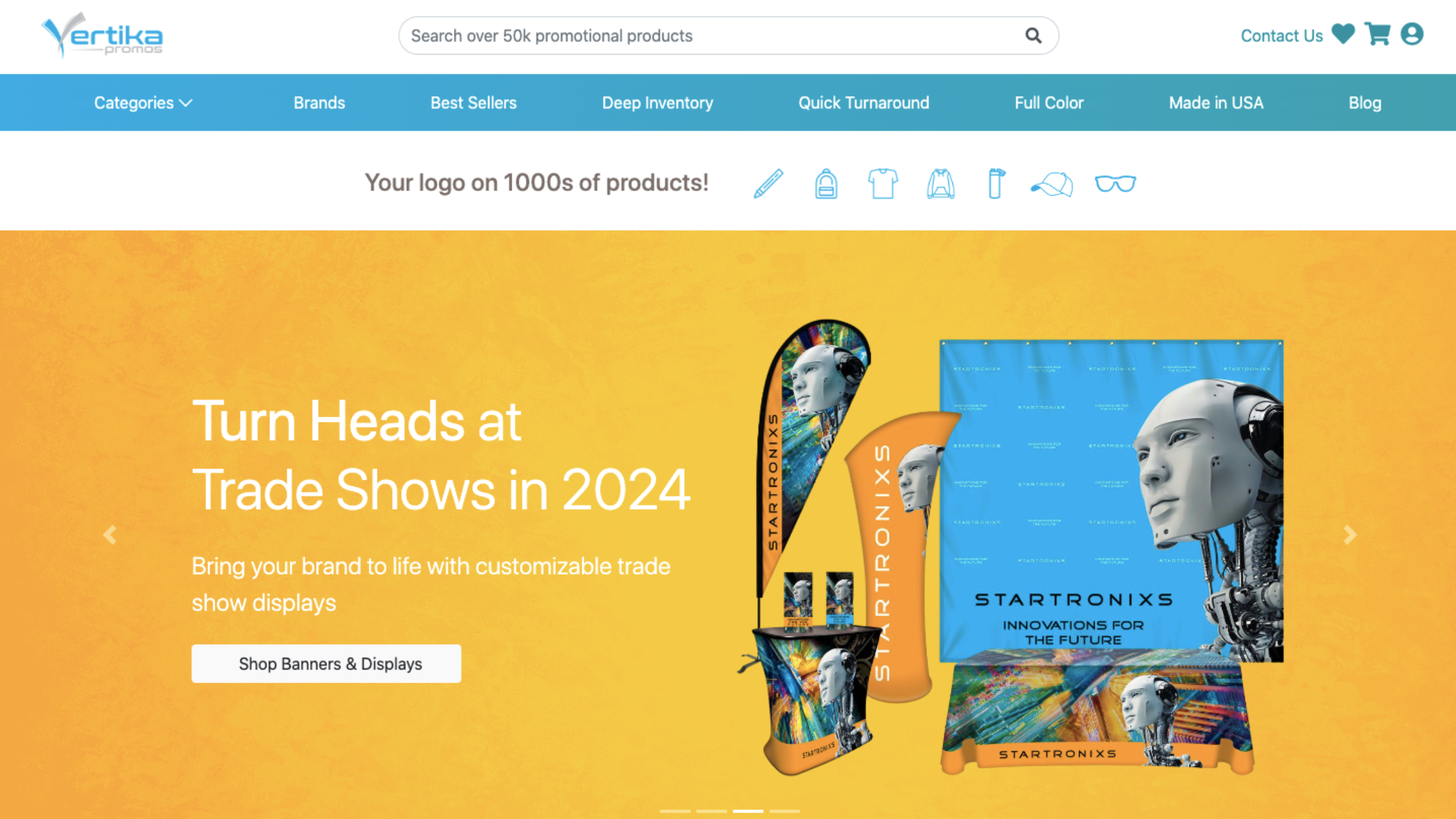
At Vertika Promos, customizing merchandise with your logo takes minutes. You simply upload your logo file directly to the product page, choose your colors and quantities, and you're done. No back-and-forth, no complicated order forms, just your brand, on thousands of products, ready to go. Whether you need 50 branded water bottles for a corporate event or 200 custom tees for your next market, it's all there, and it's all customizable.
The Quick Recap
Designing a logo that looks great on merchandise comes down to a few non-negotiables: keep it simple, use limited colors, choose fonts that hold up at small sizes, and make sure you save it in the right file format. If you're working with a tight budget, free tools like Canva, Looka, and Hatchful can absolutely get you to a solid result.
The goal isn't perfection on day one. The goal is a logo that's flexible, clear, and ready to represent your brand wherever it ends up on a screen, on a hoodie, or on a coffee cup in someone's hands every single morning.
That last one? That's the kind of brand visibility no ad budget can buy.